Visual Rhetoric: Making Arguments Visually Using Elements of Visual Grammar
Published on September 7, 2017
When designing visuals, we often neglect to identify a purpose beyond simply representing data. But visuals – particularly data visuals and infographics – are most effective when they are designed with a clear purpose in mind, particularly if they contribute to an argument. Melissa Clarkson’s earlier post on The Elements of Visual Communication provided a good starting point for a discussion of how to use visual elements to communicate types of relationships: this post expands on those concepts in explaining how visual grammar can contribute to making an argument.
What is Visual Grammar?
Understanding visual grammar – the components and relationships that contribute to meaning – in visual language – is key to developing effective visuals. As in linguistic grammar, we rely on a shared, often culturally specific, set of patterns and expectations in building and interpreting visual texts. We can start to understand this term by examining something we are already familiar with: linguistic grammar. This is the set of rules or principles that govern the composition of language in order to make shared meaning. In other words, grammar involves: (1) the components of language (letters, words, clauses, phrases) and (2) their relationships that contribute to meaning.
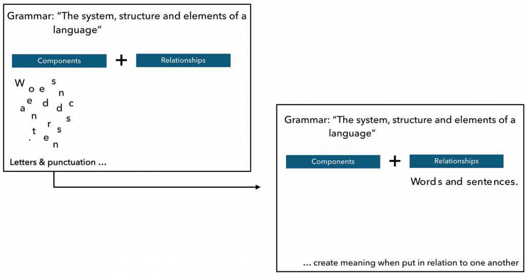
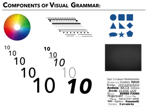
Visual grammar is the same, except that we are working with different components and relationships, alongside less well defined rules about how they go together. Clarkson’s post has already identified some of these components, but this is a more expansive list:
|
|
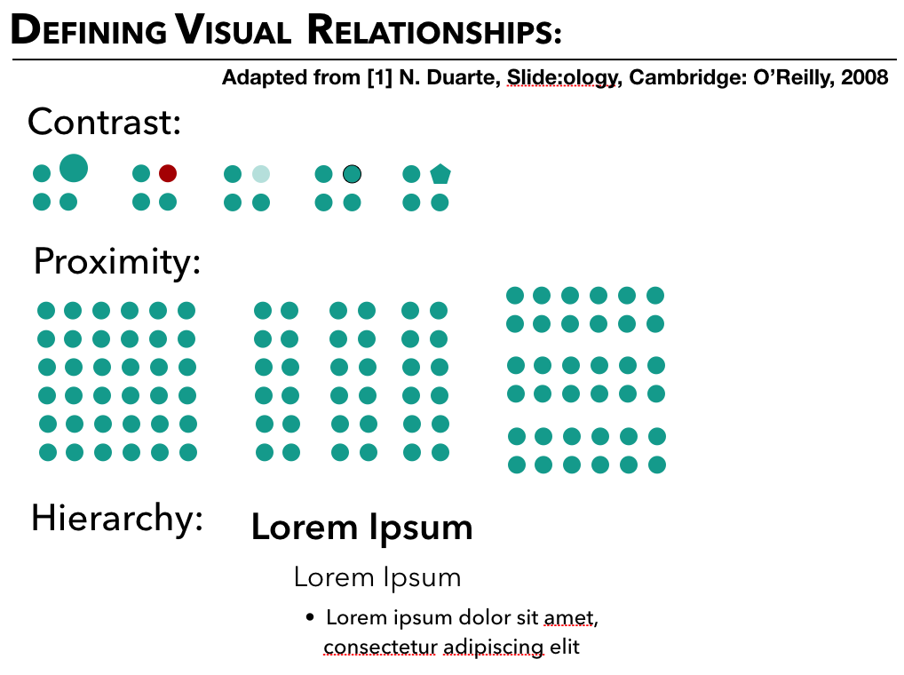
And the relationships we work with in the visual domain are also different:
|
|
Below, see how we can use these relationships in designing visuals using different components, such as color, line, size, position, and shape.
Visual Rhetoric:
Understanding those components can also help us to understand how to form effective visual arguments, as in the poster below, which uses components such as line shape, colour, size, typeface, style, and even whitespace. But it relies primarily on relationships between elements to create a clear and effective answer to the question it poses, even without stating it directly. This case study in visual rhetoric helps us to understand how arguments can be constructed by components and their relationships.
![]()
[2] Toronto Environmental Alliance
![[2] Toronto Environmental Alliance](http://d3n8a8pro7vhmx.cloudfront.net/toenviro/legacy_url/1320/Transit_20Comparison_20Poster-1-.jpg?1419018384)
This poster, produced by the Toronto Environmental Alliance, became a prominent part of the debate around transportation planning and engineering in the city of Toronto in 2011, as residents debated plans for new investments in transportation infrastructure. The poster compared plans to develop a new rapid light rail network with plans to extend the existing subways with limited city and provincial funds allocated for the city, asking “which plan has the most winners?” Without giving an explicit answer, and by making use of elements of visual grammar and developing important relationships between the two sides, this post provides a strong argument for the Light Rail Network.
The poster uses a variety of different visual grammar components. The unique shape of the Greater Toronto Area forms the blank map on which lines show the routes for the different plans, with color signifying the difference between old and new. While a consistent font is used, various styles and sizes (bolding, all caps, different colours and shades) differentiate between types of information provided. Line is also used to create separation between the two versions, and types of information.
But the argument the poster makes relies on the relationships between the components on either side of the major dividing line: in part, it relies on the structural similarity of the two sides, but it also relies on the contrast between the two sides of the visual. These relationships between the information are emphasized by the use of proximity, which creates this juxtaposition. By creating similar summaries of the key features of each potential project, the visual highlights the advantages of the proposed Rapid Light Rail Network. The question is answered when the costs, numbers of Toronto areas and people served are compared with one another.
When we examine the way this argument is constructed visually, we can start to see that blank space – an component we hadn’t identified above – in the map and the list of areas served also helps to construct the argument in the visual.
Summary:
Conceiving your visuals in terms of components and their relationships that contribute to making an argument can help you to plan visuals more effectively. By developing an understanding of how to use line, color, shape, and other components that create relationships, you’ll have a strong toolbox for making effective visuals with clear messages.