Elements of Visual Communication
Published on January 30, 2015
This brief tutorial introduces the foundational elements of visual communication. The emphasis is on techniques to graphically communicate (A) hierarchy, (B) grouping and (C) sequence— three concepts that are critical for designing effective figures, posters, and slides.
Here is an overview of the strategy:
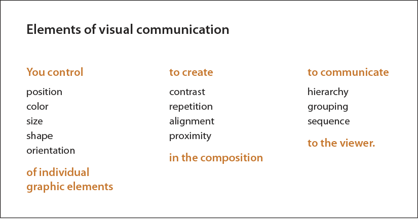
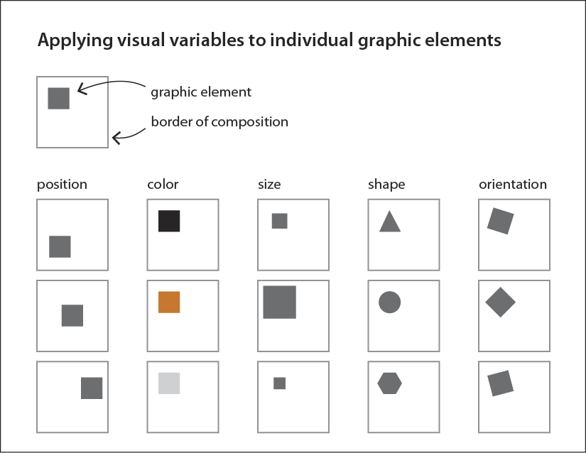
Position, color, size, shape, and orientation are variables applied to individual graphic elements. Graphic elements are the units of information that go into making a figure, slide, or poster. These include photos, icons, paragraphs of text, and titles.
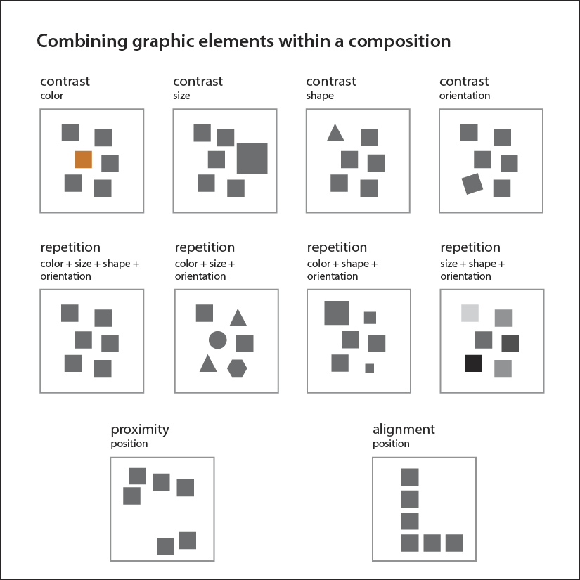
Next, the graphic elements are combined into compositions where contrast, repetition, proximity, and alignment, defined below, are created. (To learn more about these principles, see The Non-Designer’s Design Book, by Robin Williams.) A figure, poster, or slide is a composition of individual graphic elements.
Contrast: Elements have noticeably different visual characteristics then others in the composition. Created using the variables of color, size, shape, orientation.
Repetition: Elements have consistent visual characteristics within the composition. Created using color, size, shape, and orientation.
Alignment: Elements have been arranged to create an imaginary line within the composition. Uses the variable of position.
Proximity: Elements are close together within the space of a composition. Uses the variable of position.
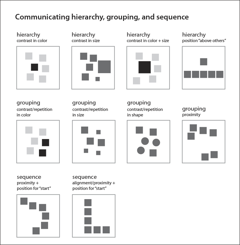
By wisely using visual variables and creating contrast, repetition, alignment, and proximity within the composition, you can communicate to the viewer the relationships among the elements of your composition. Clearly establishing hierarchy, grouping, and sequence through visual methods allows the viewer to quickly understand how the pieces of information in your figure, slide, or poster relate to each other—and therefore to more quickly understand the information itself.
Hierarchy: A dominant-subordinate relationship among elements.
Grouping: A relationship that specifies the elements to be associated together.
Sequence: A relationship among elements that specifies first, second, third…
As you examine the examples in the figure below, consider which of the compositions would communicate differently if it was turned on its side or upside down. In the top row (the four compositions demonstrating hierarchy), the first three compositions could be turned without changing what is communicated. But the fourth could not because it relies on the variable of position to communicate hierarchy. Using position as a way to communicate hierarchy works because we associate dominance in a hierarchy with the physical position of being “above” or “at the top”. Similarly, how we interpret a sequence (demonstrated in the last row) relies on position, following convention of reading English from left-to-right and top-to-bottom.
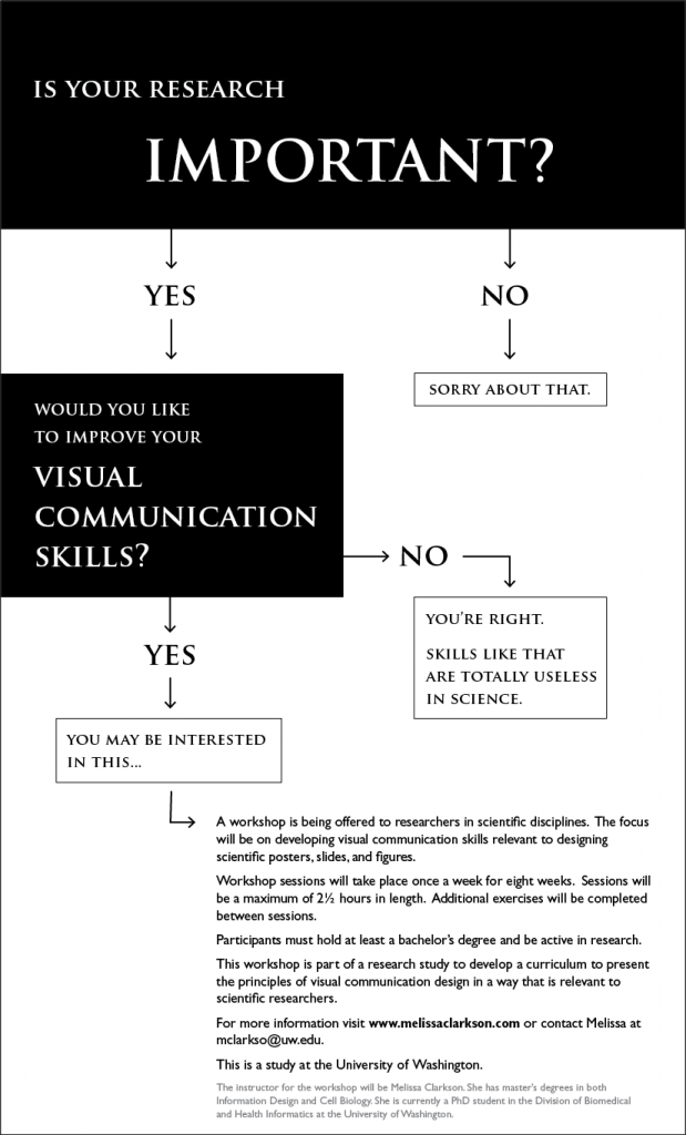
Now that you have seen these principles of visual communication demonstrated using simple shapes and without any context, it is time to apply this thinking to a real design. Below is a flyer I designed for a visual communication workshop.
First, identify all the uses of alignment. Which of these alignments simply serve to give the poster a tidy appearance, and which have a role in helping to communicate the information in the poster?
I chose to use two fonts are used in the flyer (Trajan Pro toward the top, Gill Sans at the bottom). Where is contrast used in the typography? Where is repetition used? What purposes do they serve?
Next, describe how hierarchy, grouping, and sequence were created within the flyer:
Finally, here are some tips to help you avoid common mistakes in your designs:
- You must create a clear hierarchy within the composition so that the viewer knows what is most important and where they should initially focus their attention. If you try to emphasize everything, you end up emphasizing nothing.
- If you have created contrast, the viewer expects the contrast to mean something. Therefore, if you have several elements in a composition that are similar, keep them visually consistent. Don’t choose different colors for each one simply because your software makes it easy to do so.
- Use alignment within your composition wherever it makes sense. Sometimes this alignment helps to communicate with the viewer (for example, “these are a group”, “these are a sequence”). Other times it simply helps to reduce visual clutter, so the viewer can more easily direct his or her attention to elements of importance.
- Limit your color palette and use highly saturated colors sparingly. As you can see in the examples I provided, color is a powerful way to attract attention to individual elements. But when used carelessly it is a way to overwhelm and confuse your viewer.
 |
About the author: Melissa Clarkson is a researcher, information designer, and educator working at the intersection of informatics, design, and life sciences. She is a graduate of the PhD program in Biomedical and Health Informatics at the University of Washington. Her masters training in design was at Carnegie Mellon University, and she has also received a MA in Molecular, Cellular, and Developmental Biology from the University of Kansas. Her research focuses on how to clearly communicate complex and technical information. In her role as an educator she teaches visual communication skills to scientists and engineers. Her portfolio is available at melissaclarkson.com |