This page lists resources we’ve developed and aggregated on visuals in engineering communication. We’re currently just starting to develop our content, so please check back soon to see if we’ve added more.
The Elements of Visual Communication
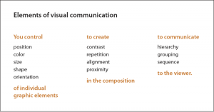
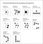
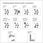
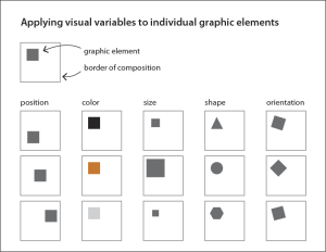
Melissa Clarkson‘s new contribution to the site, on The Elements of Visual Communication, identifies key strategies for graphically communicate (A) hierarchy, (B) grouping and (C) sequence, three relationships that are essential to creating meaning in visual design.
Design your slides to maximize Signal to Noise Ratio
Most engineers are familiar with the concept of signal to noise ratio: maximizing signal and minimizing noise is a governing principle in communication technology design. What some may not know is that the concept can also be used in information and document design, where it is also considered a governing principle, especially in the design of visuals. Learn about it in this post.
Slide Titles … Scratch that … Use Sentence Headers for Clarity and Focus in Slide Design
In many engineering presentations, slide headers are used to indicate the topic or subject of a slide. But are they the best way to frame a slide? This post, titled “Slide Titles … Scratch that … Use Sentence Headers for Clarity and Focus in Slide Design,” questions this strategy.


