Infographic Errors: How People Err in Designing Visuals
Published on September 4, 2017
As news organizations, governments, and corporations struggle to communicate more complex information to multiple audiences, they increasingly rely on visual representations. Quite a number of prominent failures in visual design that have played out in the media over the past few years; looking at these failures can help us avoid our own, and develop some principles for visual design.
Some of these errors revolve around data honesty and integrity, as documented by Media Matter’s A History of Dishonest Fox Charts. Some of these errors are outright lies, but even the most innocuous of these errors show how easy it is to manipulate data visually, and at the same time, how to lose credibility quickly as well. Take for example, this representation of the unemployment rate, which changes the scale of the line graph as we move from March to November 2011. Although unemployment was at its lowest 2011 point in in November, the chart places it above March, making 8.6% equivalent to 9.0%. Regardless of intention, this easily spotted error – one of many identified in the series of Fox News infographics documented above – damages the credibility of the organization.
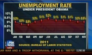
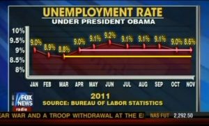
Principle 1: Be honest to the data you’re representing.
In another case, a widely circulated New York Times story documented the deeply problematic use of PowerPoint in military strategy development and communication. The article quotes Gen. Stanley A. McChrystal, the leader of American and NATO forces in Afghanistan: “PowerPoint makes us stupid,” and highlights a series of visuals from this deck on strategy in Afghanistan, with visuals that resembled “a bowl of spaghetti.” These cluttered visuals make it very difficult to extract any meaningful information: there is no longer any signal, only noise. Furthermore, these visuals are more than just confusing and meaningless, he argues, because they “can create the illusion of understanding and the illusion of control” of a external situation through representation. Even the text summaries of the visuals – in paragraph form no less – are unhelpful, failing to connect to the visual representation in any meaningful way.
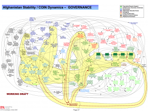
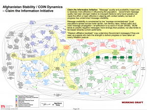
Principle 2: Create visuals with a clear, uncluttered message.
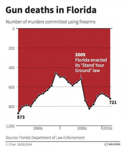
This Reuters visual was also prominently critiqued for having a specific political bias: to make it appear that gun deaths in Florida had gone down since the state enacted its “Stand your Ground” law, when in fact the opposite had occurred. The designer, critics argued, flipped the y-axis in order to show a decrease when in fact there had been an increase since the mid-1990s, and was being dishonest with the data in order to make that argument. In actuality, the graphic was attempting to create a visual impact akin to the dripping of blood, and emulating a strategy perhaps best demonstrated in a usually admired New York Times graphic. In fact, most of the articles that used the visual got the data right: but the visual – often viewed stand alone – was misleading.
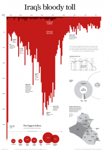
The Times graphic differs for a few key reasons: it tracks many more data points individually, and the “bleeding effect” is much more pronounced, so that the intent is more obvious. Those points look like dripping blood, whereas the line graph used in the Florida does not. Regardless, both these visuals employ chartjunk, a term visual guru Edward Tufte coined to the describe the unnecessary intrusion of graphical elements into data representation. For Tufte, chartjunk is always undesirable because it interferes with the data, thought there’s a larger debate about the value of aesthetic elements in visuals.
Principle 3: Don’t allow chartjunk to interfere with or distract from the visual’s message.
 But even professionally produced visuals can suffer from uncertainty of purpose. Take for example, this visual tweeted by Tesla motors shortly after the initial release of the Model 3 in 2017. It was meant to reassure buyers – who had already provided a deposit – that they would get their cars soon, but contained almost no information whatsoever. There are no scales on either axes, and hence, no sense of how many cars would be produced, or when, giving their customers none of the information they wanted.
Principle 4: Consider your audience, and provide the information they need.
Have you see any other major infographic fails? Add them in the comments below and maybe we’ll discuss them in a later post.