Book Reviews: Graphic Design/Page Design

The Ohno Book: A Serious Guide to Irreverent Type Design
James Edmondson. New York, NY: Princeton Architectural Press. 2025.
Index terms — design, fonts, lettering, typography, word shapes
Reviewed by Michelle Gardner
In The Ohno Book: A Serious Guide to Irreverent Type Design, James Edmondson invites us into his typographic playground and shows us how to blend exuberance with discipline and expressiveness with market sense. This is a book you’ll want to keep on your desk but be careful not to become mesmerized by the visuals and lose all track of time.
Graphic designers, typographers, students of type, lettering artists, and anyone interested in the texture and personality of letterforms will draw plenty of inspiration from these pages. If you love the idea of fonts with attitude or want to learn how to apply type design to packaging, posters, apparel, or other kinds of branding, then let this book speak to you.
Every time Ohno creates a new typeface, they write a process article. Edmondson dedicates more than 100 pages in his book to the process of fonts like Obviously, Degular, Vulf Mono, Casserole, and Beastly.
The entire appendix (almost 60 pages) offers tips on drawing type from A to Z. Edmondson started a series on social media where he analyzed every letter of the alphabet and addressed common pitfalls when drawing each glyph. From this appendix, he encourages you—whether student, professional, or somewhere in between—to make your own mistakes and learn from them.
You’ll find helpful tips in the appendix like “if it looks wrong, it is wrong” (p. 213), “type is inextricably linked to calligraphy” (p. 222), “horizontals appear thicker than verticals” (p. 227), and “spacing is the most important thing in type” (p. 231).
Call it what you will: a design manifesto, a practical handbook, or a celebration of creative letterform, The Ohno Book brings Edmondson’s real-world experience to type design. From that time in eighth grade when he got a pack of calligraphy pens, to enrolling at California College of the Arts, to getting into TypeMedia in The Hague, Netherlands, to starting his own foundry, it all has a place in the creation of this tome.
You’ll discover that type design doesn’t have to be constrained by tradition. Working from the heart and soul of Ohno’s fonts (think Beastly, Casserole, and Hobeaux), he uses the book to trace how such irreverent work can be disciplined, practical, and professional.
Besides showcasing many type samples (undoubtably the gift of all gifts to artists and students of type), Edmondson guides you the how-to of designing fonts, balancing creativity and practicality, and earning a living as a type designer.
The specimen sheets and process sketches included in The Ohno Book show the work involved in getting to the final product. Because letter-shape matters beyond mere legibility, you’ll learn how spacing and metrics communicate a type’s personality.
Even though type design ultimately depends on precision for achieving the range a font needs (light, regular, medium, variations of bold, italic), it truly does benefit from playfulness and curiosity in the process. Those two elements embody the human factor of design amidst automation and standardization.
Moreover, the book complements Edmondson’s podcast and website, so be sure to engage in every medium to fully engage in the wonder that is Ohno. They’ll spark ideas, arm you with practical insights, and remind you that typography is more than just letters, it’s the joy of creation.
The book is incredibly fun to look through, so if you decide to share it with friends or colleagues, be sure you get it back!
Are you wondering why Edmondson calls his foundry, OH no Type Co? In the frequently asked questions on his website, he explains that designing the spaces inside and between letters is the often overlooked but supremely important aspect of designing type. H, O, n, and o are incredibly influential letters when it comes to spacing. The name uses those letters because of their reference to proper spacing and respect for the craft.
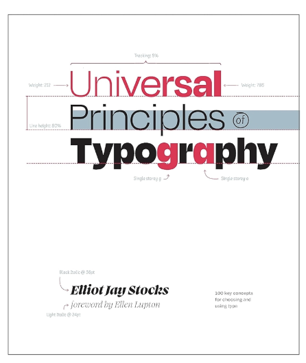
Universal Principles of Typography: 100 Key Concepts for Choosing and Using Type
Elliot Jay Stocks. Minneapolis, MN: Rockport Publishers. 2024. 224 pages, including index.
Index Terms—design principles, responsive design, type size, typography, web-font technology
Reviewed by Michael Opsteegh, Lecturer, California State-Long Beach.
One primary way technical communicators communicate is through text, and yet, we spend little time thinking about how that text is designed or what impacts font choice and spacing have on the delivery of our information. Sometimes, we just aren’t aware of our own lack of understanding to make sound typographical decisions or we just forget. This is why a book like Elliot Jay Stocks’ Universal Principles of Typography: 100 key concepts for choosing and using type deserves a place on every technical communicator’s bookcase.
I’ve read many typography books over the years, and this book is now one of my favorites. Not only did I learn new things about type (size doesn’t exist?), but I also reacquainted myself with aspects I’d forgotten (like the em square). And if you think this is just another stodgy book about picas and page grids, think again. This book covers some of the most recent developments in web-font technology, like variable and color fonts. Stocks gives plenty of illustrations of responsive typographic design and sprinkles examples of CSS throughout the book.
I would also recommend Universal Principles of Typography to students, beginning writers, and early graphic designers because Stocks writes about typography in such a cheerful tone and conversational style as to make the material not only accessible, but also riveting. In Ellen Lupton’s forward, she compares Stocks’ writing style to talking with a good friend about their favorite subject. Stocks’ passion for typography permeates every page, which draws the reader further in even as the subject becomes more technical.
The book examines 100 typography principles in six sections. Each principle is depicted as a two-page spread, with a cheerful description on the left and lavish illustration on the right. These bite-size principles make it easy to leisurely read a principle during your morning coffee; what a great, inspirational way to start each day. The book’s six sections makes it an easy-to-navigate reference.
My only complaint is that Stocks sometimes favors brevity to the detriment of context. For example, he dedicates one of the 100 principles to discussing spaces around dashes, without explaining the rationale behind his recommendations. He simply says, “perhaps a thin space, or a hair space — is usually preferable” (p. 128). But, why? Among the design community, there appears to be no clear consensus, so an explanation is needed here. Some designers advocate for spaces because they fear em dashes collide with the letters on either side. Others advocate for no spaces around em dashes because the em dash creates so much white space already. And still others split the decision and advocate inserting thin spaces only to avoid collisions. Opinions on en dashes are a whole other matter. Granted, this is a small detail to pick on, but it highlights the need for designers to educate readers and provide context and rationale behind their recommendations.
Perhaps my small complaint, which could be leveled at any number of design books, could be seen as a compliment. Stocks left me wanting to read more. I didn’t grow tired of learning the principles of type. I wanted that enthusiastic conversation with a good friend to continue longer.
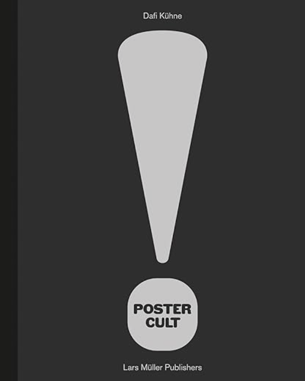
Poster Cult
Dafi Kühne. Zurich, Switzerland: Lars Müller Publishers. 2025. 163 pages.
Index Terms—design principles, letterpress, typography, visual communication
Reviewed by Amanda Horton, Director – Design History Minor, University of Central Oklahoma.
Swiss typographer and poster designer Dafi Kühne’s latest book, Poster Cult, will be an instant hit with audiences. The book is destined to become a collector’s item for practicing graphic designers, design educators, students, and anyone interested in experimental typography and experimental letterpress techniques. Poster Cult is Kühne’s second monograph published by Lars Müller Publishers, following the first publication, True Print. The book is beautifully laid out with numerous examples of posters by Kühne. Yet, the presentation of the content in Poster Cult is almost like that of a methodology for a master’s thesis.
There is very little written content, but the content is essential for imparting Kühne’s design philosophy and process. Each poster presented in the book also contains details about its production, including the number of printing passes each poster takes, anywhere from 2 to 13 passes appears to be the standard. However, at least one poster, Kunststipendien der Stadt Zürich (p. 24), was produced with no less than 23 passes. Other details include the edition number of posters produced, size and formatting details, as well as methods for their production, such as the use of metal type, Hand Cut linoleum, Polymer plates, or laser-cut MDF, just to name a few of the processes Kühne uses for his posters. While you could read the entire book in an hour or two, you could pour over the posters and the processes used to create them for days on end. The information about processes and methods is supported by the inclusion of a glossary that defines and explains the methods in detail.
Kühne uses the glossary and supporting text to explain his remarkable design process and to break down his elaborate use of the letterpress printer for the production of his posters. The glossary includes a definition of Poster Cult as, “The unconditional devotion, care, cultivation and worship of the medium of the printed poster.” (p. 139) Readers will come away with a sense that Kühne is invested in the process as a form of design research. This process includes both analog and digital techniques and a wide number of methods; Kühne does not believe in limiting oneself to style or method. The end pages include a series of photographs taken by Peter Hauser that show Kühne at work in his studio, undertaking several techniques such as carving a linoleum block and hand-setting metal type for the production of the posters in the book, which will help the readers to understand the laborious detail that goes into the making of each of the posters.
Designed by Kühne, the content presentation is an experience in itself. Perhaps one of the most interesting aspects of Poster Cult is the detailed inclusion of the process for each of the posters. Kühne’s layout and presentation of methods and processes, which reveal instead of conceal, and by presenting the techniques used to produce all the posters in the book in this manner, seems to challenge the viewer to attempt the methods on their own.
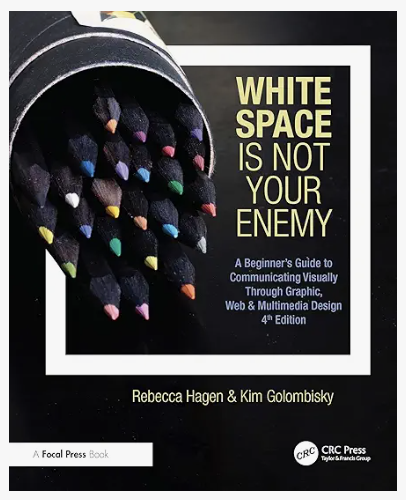
White Space Is Not Your Enemy: A Beginner’s Guide to Communicating Visually Through Graphic, Web & Multimedia Design, 4th ed.
Rebecca Hagen and Kim Golombisky. Boca Raton, FL: CRC Press. 2025. 288 pages.
Index Terms — graphic design, multimedia design, web design
Reviewed by Elizabeth Hardin, The University of Alabama in Huntsville (Elizabeth.Hardin@uah.edu).
White Space Is Not Your Enemy: A Beginner’s Guide to Communicating Visually Through Graphic, Web & Multimedia Design by Rebecca Hagen and Kim Golombisky is a beginner’s guide to graphic design and visual communication. It makes a good textbook for design students early in their academic careers. It could also work well for students in programs like marketing, communications, or technical writing—academic fields where professionals need to know the basics of putting together attractive documents or websites, but don’t focus primarily on art. While the book is easy to read and has a lighthearted tone that I think would appeal to students, the authors’ credibility and experience are evident. The book is packed with helpful visual examples of both effective and ineffective design.
Even though its primary purpose is academic, the book also offers practical guidance for professionals. Someone new to document or web design work could also use it to quickly learn the vocabulary and pick up the basics. There’s a good balance of practical advice and theoretical foundations here. For example, in Chapter 3, the authors introduce the “works-every-time layout” and encourage new designers in a hurry to use it, “put it in [their] design toolbox, and don’t apologize for using it” (p. 22). Similarly, Chapter 4: Layout Sins defines and exemplifies thirteen common errors in document and web design, offering a crash course on what not to do. Beginner designers could easily use the “works-every-time” layout, avoid the thirteen layout “sins,” and borrow the font pairings and color palette suggestions from Chapters 7 and 8 to get a pretty firm grasp on designing attractive, effective layouts.
For readers looking for more theory, Chapters 5 through 9 provide a more thorough explanation of the principles of visual design. Chapter 5: Mini Art School covers six elements of visual communication, seven principles of useful design, and the six Gestalt laws. Subsequent chapters go into detail about layout, typography, and color. The second half of the book moves from general visual design principles into more specific applications, like designing infographics and creating multimedia content animation, video, and websites. While readers won’t get an in-depth guide to filming or website creation, these chapters do provide an overview of the planning, design, and testing that goes into these types of communication.
Each chapter ends with a few “try this” activities. They’re engaging exercises, but they’re not all full assignments or projects; instructors could use many of them as discussion prompts or homework exercises. These activities often instruct the reader to find examples of the design element of principle covered in the chapter. One of my favorites instructs readers to “go to the candy aisle at your grocery store” and study and categorize “the font choices on each package” (p. 112). Activities like this are great reminders that visual communication is everywhere. Instructors looking for more fully-developed assignments and projects should visit the book’s website, where the Instructors Manual provides detailed teaching resources for each chapter. Other readers, students and professionals, will appreciate the Resources for Students page, which features tutorial videos and the links to sites to download fonts, images, videos, and other media.

Understanding Color: An Introduction for Designers, Sixth Edition
Linda Holtzschue. Hoboken, NJ. John Wiley & Sons, Inc. 2025. 192 pages, including index.
Index terms —color in business, color and communication, color in design,
Reviewed by — Joanne M. DeVoir (jmdevoir@gmail.com).
Understanding Color: An Introduction for Designers, Sixth Edition is a comprehensive guide for the effective use of color in design. This edition provides clear, practical details about the science of color and how to use color effectively to communicate, explain, and market ideas. Linda Holtzschue, a New York interior designer and former instructor at the Fashion Institute of Technology and Parsons School of Design, is recognized as an authority on color theory and design.
The primary audience is students and instructors in design and art schools, but Holtzschue also writes for professionals who want to learn how to use color in their daily work. The book will especially interest communication professionals, including technical writers and user design specialists, who want to understand how color influences meaning and readability. Holtzschue reviews the fundamentals of color theory and also demonstrates real-world application in print, product design, and digital media. The book’s style and structure, as well as the online companion workbook for students, make it suitable for both use as a textbook and as a resource for professionals.
This book is organized into twelve chapters. Chapter 1 describes color as language and illustrates how culture, time, and context shape its meaning. Color “delights, informs, identifies, warns, embellishes the ordinary and brings beauty and drama to everyday objects” (p. 1). You can use color to communicate without words or to enhance or reinforce the meaning of text.
Chapters 2–5 explain the science and perception of color. Holtzschue discusses color study, properties of light, additive versus subtractive mixing, hue, value, saturation, tone, as well as human physiology and psychology of color perception. These sections explain how our brains perceive color and why colors look different under varied lighting conditions.
Chapters 6–9 describe color interaction, color theory, illusion, and harmony. Holtzschue demonstrates how surrounding hues alter perception, why boundaries can appear to vibrate, and how harmonious palettes are created through intervals of hue, value, and saturation. These chapters encourage the reader to observe color effects firsthand. As someone who does not have a design background, I especially enjoyed the chapter on the history of color theory. Ideas about color have evolved over time and concepts like the color wheel and primary colors are the result of centuries of debate among artists and scientists.
The final three chapters explore how professionals use color in business applications such as printing, product design, web design, and marketing. Holtzschue explains pigment strength, spot colors, color management on screens, web coding, color forecasting, digital display modes, and emerging technologies. She explains how brands build identity through color and how industries develop palettes that shape consumer perception. Color is fundamental to business: “Color is the largest single factor in a consumer’s decision of whether or not to make a purchase” (p. 149).
Throughout Understanding Color, Holtzschue discusses color in terms of science and culture. She postulates that effective design requires not just aesthetic understanding but also knowledge of physics, human physiology and psychology, and cultural symbolism.
Professional communicators will find much of the book’s content relevant. Technical writers and user-experience designers can apply the discussion of contrast and harmony to improve readability and user experience. Any content professional with a global audience will benefit from the discussion that the same color can have quite different meanings in different regions of the world. Writers will also appreciate the discussion of how color can appear differently in print versus on screens.
Holtzschue writes in an engaging style and balances theory with application. She uses full-color, visually appealing illustrations with detailed descriptions. She also references real design examples to reinforce concepts. Each chapter is structured with logical and clear headings, and the book includes a comprehensive glossary, bibliography, and index, which makes it easy to use Understanding Color as a reference guide.
The examples used throughout the book are mostly from art, graphic, and product design. Readers outside of the design world will need to think about applications in their own professions.
Another limitation is that Holtzschue does not significantly explore accessibility issues, such as designing for color blindness or meeting digital contrast standards. Hopefully, she will expand coverage of accessibility guidelines in a future edition so that communication professionals can ensure that their content reaches the widest possible audience.
Understanding Color is an excellent resource for anyone interested in understanding color and its use in product design. It explores science, art, and application of color with practical examples. Holtzschue clearly explains the fundamentals of color and how to use it effectively in design. The book provides a solid foundation for students as well as a reliable reference for professionals who want to use the power of color in their own work.
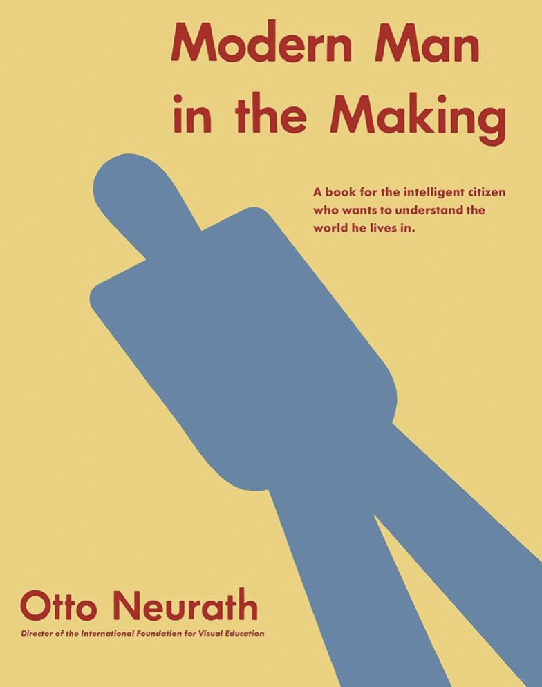
Modern Man in the Making
Otto Neurath. Zurich, Switzerland: Lars Müller Publishers. 2024. 160 pages.
Index Terms—bias, ISOTYPE, minimalism, modernity, visualizations
Reviewed by Amanda Horton, Director – Design History Minor, University of Central Oklahoma.
Otto Neurath’s Modern Man in the Making was initially published by Alfred A. Knopf in 1939; this edition is a facsimile reprint by Lars Müller Publishers. Otto Neurath (1882–1945) is widely regarded in history as both a sociologist and inventor of the ISOTYPE system, previously known as the Vienna Method. ISOTYPE was a system devised by Neurath and his team as a method for visualizing statistical information to audiences of various backgrounds. It used both graphics and text to convey data efficiently and has been lauded for its place in universal approaches to modern design. This book shows this system in action.
While the book’s overall thesis is not exactly clear, the contents do center around examining the elements that lead to a modern society. Yet not all the contents serve this theme well. Chapters include “Past and Present,” “Unification of Mankind,” “Trends towards Modernity,” “State of the World,” “Social Environment,” and “Man’s Daily Life.” The text is offset with an abundance of ISOTYPE charts and visualizations. And while there is written content to support the ISOTYPE charts, the emphasis is on the charts themselves. Attempts by the written content to contextualize the charts are not always helpful, and it is not always clear why specific data is used to present the points. The selection of cultural data is not always clear either.
While many books about the ISOTYPE exist, this book is interesting in that it shows how Neurath used ISOTYPE charts to make conclusions about culture, societies, and, in this instance, the movement towards what he perceived as modernity. Though Neurath was considered a revolutionary thinker of his time, reading his 1939 book shows some clear instances of bias. For one, the book predominantly uses the male default, as indicated by the title, with numerous other instances of this default appearing throughout the text. Additionally, some civilizations are shown as “modern,” while other civilizations are sometimes presented as “backward”; this represents a clear bias. One example states, “…despite the backwardness of such Western countries as Latin America and the Soviet Union” (p. 48), though Neurath doesn’t state why he describes them as backward. And while the author presents some good insights from the charts and their reading, there are also some troubling ones. Overall, Modern Man in the Making represents an oversimplification of the history of human mankind and its movement towards modernity.
Though the contents are interesting from a historical perspective, if you consider the bias, the value of this book lies in the abundance of ISOTYPE charts and statistical representations. This book is not a must-read, but it is a collector’s item for modern design aficionados. It provides an interesting picture of a period between the two world wars when radios and automobiles were gaining traction and becoming an essential part of life. It would be interesting to see Modern Man in the Making reviewed from a sociologist’s or economist’s standpoint.
The Longing for Less: What’s Missing from Minimalism
Kyle Chayka. New York, NY: Bloomsbury Publishing. 2024. 264 pages, including index.
Index Terms—architecture, criticism, design, minimalism, philosophy
Reviewed by Amanda Horton, Director – Design History Minor, University of Central Oklahoma.
In The Longing for Less: What’s Missing from Minimalism, Kyle Chayka presents a history and critical examination of minimalism, considering it from an art, architectural, and philosophical perspective. The author divides the content into four sections: “Reduction,” “Emptiness,” “Silence,” and “Shadow.” In some ways, this book was not expected, beginning with the recent minimalism movement in which influencers encourage people to get rid of stuff, and yet it explores minimalism deeply and with thoughtful consideration.
After considering the influence of modern minimalism and the “Marie Kondo effect,” Chayka transitions to consider minimalism in terms of architecture and art. The content on architecture emphasizes Philip Johnson’s Glass house which the author points out is appropriated from Johnson’s mentor Ludwig Mies van der Rohe’s, former director of the Bauhaus, design for the Farnsworth house. Yet Johnson’s design takes the Farnsworth house to the extreme conclusion of minimalism and Chayka points out the flaws of such an extreme. In terms of art the content focuses on Donald Judd’s minimalist sculptures and installations, though, as Chayka points out, Judd did not like the term minimalism when describing his art. The history that is presented jumps around and indeed Chayka argues that “minimalism’s lack of a coherent history is in part due to its nature—it instinctively tends to erase its own background as if starting anew in each iteration” (p. 15).
While design is broadly considered, minimalist graphic design history is omitted. There are limited references to the application of minimalism to logo design and its apparent application in website design, but the history of minimalism in graphic design, beginning with the Plakastil movement in Germany is not mentioned. Nor does it contain information or criticism on the current global trend of modern/minimalist identity design. Yet despite these omissions, it is interesting that the The Longing for Less does include the influence of minimalism on music, which is a very unexpected topic to consider. Chayka also connects minimalism to the philosophies of Stoicism, Asceticism, and even Zen Buddhism.
In terms of criticism, Chayka argues that minimalism is treated as a “one-size fits all process that has a way of homogenizing homes and erasing traces of personality and quirkiness” (p. 34). He points out that the Eames’s, noted for their contributions to modernism and associated with minimalist architecture and design, were known to fill their home with artifacts from all over the world, the exact opposite of minimalism. He goes on to say that “Minimalism can be oppressive. The style can make you feel like you don’t belong in a space unless you conform to it” (p. 67).
The Longing for Less is a quick read, and despite some of the heavy content is written in an accessible manner. Though the audience might be somewhat limited to academics, it is an interesting read for anyone who is sincerely interested in the history and criticism of minimalism.