Engineering by PowerPoint
Published on November 18, 2019
News in recent days about the process and decision making tools used by Boeing in the Boeing 737 Max case reminds us about the importance of communication tools in engineering. As reported by The Daily Herald [1], Boeing made a detailed presentation to the FAA after the 737 Max Lion Air crash that argued that they had shown “no process violation or non-compliance” in the regulatory process leading up to the plane’s approval. The article also, however, identified several inaccuracies and mistakes in their PowerPoint deck that may have misled regulators regarding the safety of the plane’s design, particularly around its new flight control software. While PowerPoint’s role in this set of engineering failures remains uncertain, the news certainly recalls critiques of PowerPoint as an engineering tool coming out of the Columbia disaster in 2003.

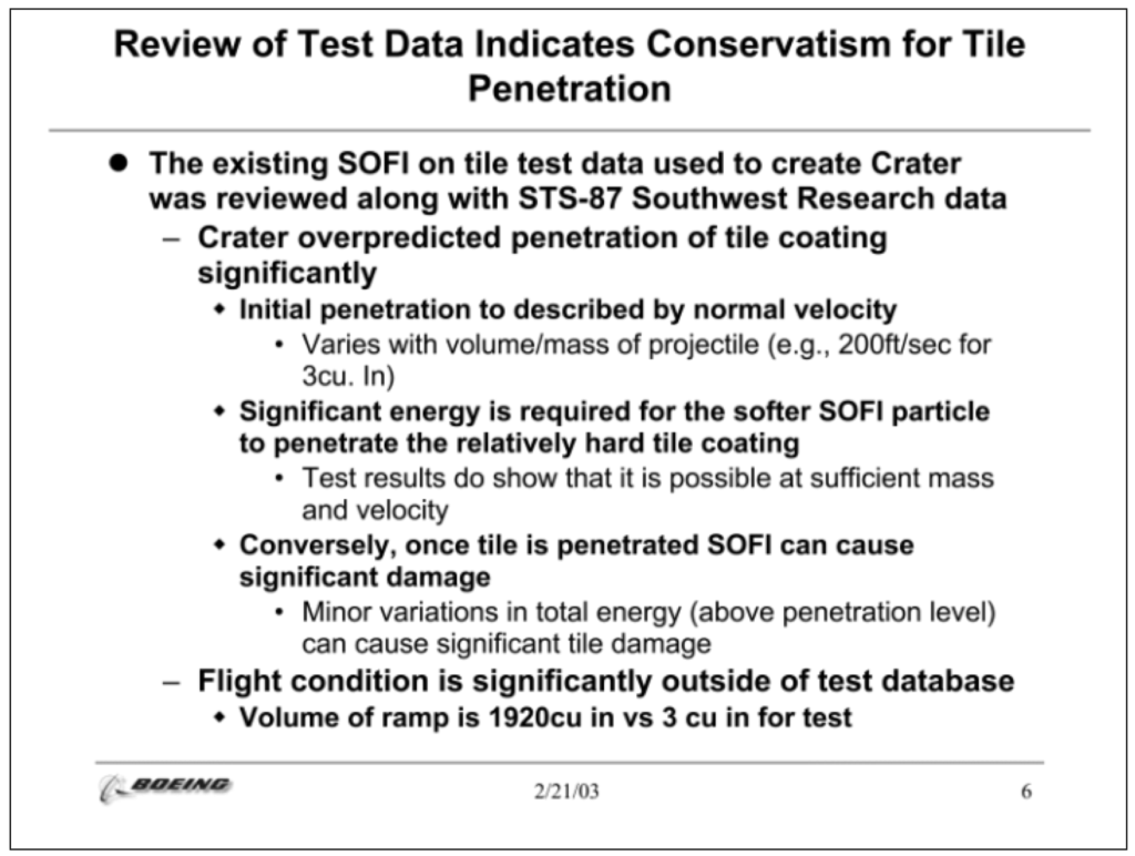
After studying the results of the Columbia Accident Investigation Board, visual guru Edward Tufte argued that “the cognitive style of powerpoint” led, in part, to poor communication during the Columbia disaster, and that PowerPoint wasn’t suitable for technical, hard core engineering work [2]. He saw the limits of the medium, including the low resolution of the single slide, the disproportionate power accorded to the slide heading, and the default mode of organization (in bullets) as preventing knowledge transfer and hampering decision making in important technical contexts. His critique focused on a single slide in the Boeing presentation made mid-mission, depicted below, pointing to the ways in which the medium facilitated poor communication about the data available and the emergent engineering recommendations. What would your response to that slide be?

Tufte’s recommendation? Use concise technical reports instead. Yet PowerPoint – and its various competitors – remain ubiquitous today in engineering corporate cultures. PowerPoint can be used poorly, just like any tool; however, critics argued that those limits are not inherent in the medium, but in users’ inability to (1) understand purpose, audience, and context, and (2) step beyond the default settings of the program.
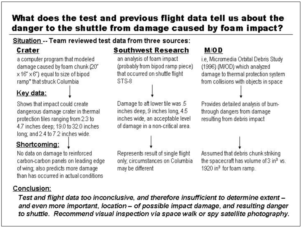
In particular, Communication Partners [3] offered a revision (in PowerPoint) of the slide Tufte critiqued that responded appropriately to the needs of the situation. Rather than provide a disorganized data dump, the revision lays out a clear conclusion, both in the title and the bottom of the slide. It took the data provided by the original slide and organized it more effectively, not in bullets with an obscure hierarchy, but as three experiments, structured around the scientific method (experimental source, results, conclusions). Despite the fact that the slide remains text heavy, it communicates clearly that their current test was insufficient to make claims about the shuttle’s safety.

This revision demonstrates that once you step beyond the defaults or templates in PowerPoint, you have the power to organize and structure information in ways that are appropriate for your purpose.
In 2019, users seem more capable of moving away from the bulleted lists that are still the default when you click +New Slide. We’ve been exposed to well designed and compelling slide presentations, such as the one that formed the basis of Al Gore’s An Inconvenient Truth, and have more well defined visual principles about how to design slides from gurus like Garr Reynolds and Nancy Duarte.
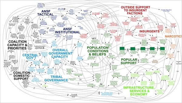
And yet, we still continue to produce decks that become the object of derision. What, for example, is happening in this famously unreadable slide charting the relationships between forces determining the Afghan political situation? [4]

Visual richness does not equal clarity, though perhaps if the message of the slide was actually that the Afghan situation was a morass, then a title speaking to that at the top might have made that slide speak particularly loudly to that point.
What we can take from Tufte’s critique of PowerPoint and the ensuing responses, then, is that perhaps the medium need not determine the message– that with careful consideration of the message, the audience, and the context, decks can be developed that allows the data to speak loud and clear. And that the tools to make that exist are inherent in the programs themselves, as long as we use them according to the right principles.
[1] HeraldNet, “After Lion Air crash, Boeing upheld its flight control system.” Date Published: Nov 9, 2019. Date Accessed: Nov 18th, 2019 Available: https://www.heraldnet.com/business/after-lion-air-crash-boeing-upheld-its-flight-control-system/
[2] Tufte, Edward. “Powerpoint does rocket science — and Better Techniques for Technical Reports.” Date Revised: Sept 6, 2005. Date Accessed: October 26, 2007. Available: http://www.edwardtufte.com/bboard/q-and-a-fetch-msg?msg_id=0001yB
[3] Communication Partners. “The Great Man Has Spoken. Now What Do I Do?” Communication Insight. Vol. 1. Issue 1. 2003. Available: http://www.communipartners.com/documents/ComInsV1._000.pdf
[4] E. Bumiller, “We Have Met the Enemy and He Is PowerPoint” New York Times, Date Published: April 26, 2010. Date Accessed: Nov 18th, 2019 Available: https://www.nytimes.com/2010/04/27/world/27powerpoint.html

