Experience Design Should Not Make Users Cry
Published on June 9, 2024
An Experience Design Review of Munich’s Altes Pinakothek Museum
By Kristin Zibell, guest author
June 2024
I thought the Albrecht Dürer masterwork painting, “Selbstbildnis imcPelzrock” would make me cry.cInstead, it was the abominable experience design of the Altes Pinakothek museum that brought me to tears.
My parents and I were visiting Munich to step inside the heart of Bavaria by visiting its fairytale castles, Baroque churches, and grand museums. All of the region’s material beauty was the result of centuries of patronage and wealth of the powerful Wittelsbach family. It was the Wittelsbach art collection at the Alte Pinakothek museum that my family and I hoped to visit in Munich that day. We had two goals: view the“Selbstbildnis im Pelzrock” by Dürer and spend an enjoyable few hours inside to avoid the rain. Our previous day’s trip to Neuschwanstein left us waterlogged and we needed an easy indoor day.
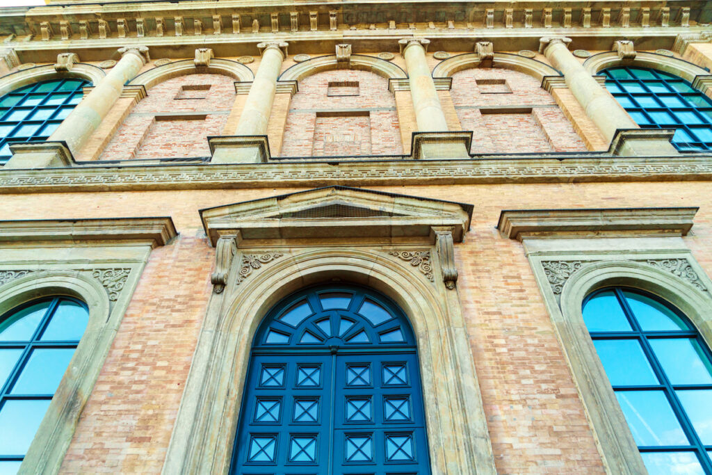
The Altes Pinakothek was a triumph when it opened in 1836. The institution was the Bavarian dynasty and Munich’s contribution to the European art museum movement. Beginning with France’s Louvre which opened in 1793 in Paris, Europe’s monarchs and aristocrats were hot on enlightenment ideals of educating the public on art history, boasting national greatness, and showcasing the ruler’s aesthetic taste through public access, the newest architectural visions, and royal painting collections. European’s rulers and royal families were also flush with funds to pay for their endeavors from the natural resources, bodies, and lives of indigenous people, colonized citizens, and enslaved Africans in the European empires’ colonies and protectorates.
My parents and I arrived at this stone beacon of imperialism and concentrated wealth at 11 a.m. Our taxi dropped us off at one corner of the expansive lawn surrounding a stone building. We walked around the block looking for signs to the museum, wondering if a sand-colored building might be our destination. We walked around the front and up a flight of stairs to the closed front door. With only our assumptions and strong hands, we opened a gigantic green door and walked into the museum.
Takeaway: A welcoming first impression is necessary for all first user experiences. Hiding the entrance risks the audience leaving or arriving with confusion and deflating confidence. How, as a designer, do you want to welcome users? A gigantic, heavy green door to a stone building does not make a welcoming experience.
A light-filled stone lobby greeted us. The coat check was on the right side and storage lockers were on the left. I knew from previous visits to German museums that we needed to check everything but the bare minimum belongings. First, we went to the coat check. I speak some German so I was able to learn that the coat check was nine euros for the three of us. I also knew lockers were free, but we needed a “pfand” or deposit of 2 euros. Luckily, my Mom had a 2 euro coin. We had learned in prior days that a stockpile of coins was a necessity for traveling in Germany.
Takeaway: Assuming knowledge on a system functions is not a reasonable expectation for an onboarding experience. Who are you designing for and what is their level of knowledge? How can the onboarding experience respect their knowledge of the experience?
We stuffed our jackets and umbrellas into the locker and looked for the ticket desk. There were no signs so I couldn’t discern if the two attendants behind an open desk were selling tickets or giving information or both. I approached the staff member and asked for three tickets. She sold me tickets, so my guess was successful.
We got our tickets and maps, but there were no directions to the Dürer, the museum’s flagship painting. Till that point, we had relied on the museum’s architecture and staff to lead us to where we needed to go. My stress level was rising. My parents maintained a constant chatter of guesses and questions as I attempted to figure out where to lead us. This buzz in my head and the museum’s non-direction caused me to mentally flail.
My mom asked a security guard at the bottom of a two story immense stone staircase for directions to the Durer. She pulled me over to get the response in German. The kind staff member led us back to the information desk so another attendant could search our small bags and give us a tag for them, which was another requirement of entry.
Takeaway: Lack of navigation cues, poor information design, and hidden procedures are only rescued by an effective help system if your user is willing to go on. At worst, the user is lost and will give up and leave.
With some renewed confidence that we were going to make it to the Dürer in the upper gallery, we turned towards the giant staircase. My Dad was on medication that made him very tired. Yesterday’s climb to a castle was enough uphill effort so we stood at the base of the steps, looked at each other, and said, “no way.” I asked another helpful staff member for directions to the elevator. We started off in the advised direction. I pushed through a heavy wooden door that led us to a room with an elevator icon. I led my parents in the general direction and found a printed out-of-order sign in front of the
elevator.
Takeaway: An inaccessible pathway is not only a non-functioning experience, it’s a frustrating waste of time. If an experience is not accessible, then it is useless.
I felt defeated. My parents, being boomers in a world of constant technological obstacles, were not deterred and still had the mental stamina to continue. I said a prayer. They found another staff member who guided us to the backup elevator.
Takeaway: Good experience design leads the user to success and does not require them to call upon a higher power for strength to continue.
Victory! I thought when the elevator doors opened and we walked through the higher floor. To our right was the large staircase we avoided to preserve my Dad’s health. And to the left… another huge door and no signage. I hesitated to open it. What if there was an entirely new puzzle to solve on the other side? My mother determined we had come too far, so I opened it… to a gallery full of paintings and people. We had to be near the Dürer.
Takeaway: A user is once bitten, twice shy. A horrible experience will deplete all the confidence a user has in their ability to complete their task and trust the system for next steps. The worst case scenario is that a user blames and doubts themselves.
We turned left and followed the natural flow of the viewing galleries. The walls are filled with serene and dramatic paintings of Catholic religious scenes. The Wittelsbach family was a branch of the Holy Roman Empire, and Munich rested on a direct trade route from the Papacy’s home in Rome. The gallery showed the Catholic Church’s content. In this museum’s paintings, women were mothers, murder victims, or prostitutes; men ruled heaven, Europe and the Church; and both genders were martyred saints who sacrificed their lives for the faith. Most of the paintings were based on stories from Biblical scripture, Holy Roman Empire history, or ancient Greek and Roman mythology.
Takeaway: Every experience design decision, functionality inclusion, and content choice is telling the user a story, but what story is it? Designers must be careful and avoid reproducing harmful dominant
stories and stereotypes.
We viewed the religious paintings for an hour and then sat down. I asked a guide where the Dürer was. He pointed to the QR codes on the wall to download the guide app. He helped me choose the right WiFi and I scanned the code. The website landing page appeared and there was no Dürer image or easy way to locate the painting’s location. I put away my phone and asked the guide for help. Maybe he saw the desperation in my face, or maybe the Altes Pinakothek hires the kindest staff or maybe both because he guided me back the way we came – just past the original entrance. We would have seen the Dürer immediately if we had turned right rather than left at first pass.
Takeaway: Digital wayfinding solutions are no substitute for clear physical pathways and good signage, especially when there is no internet connection. Digital solutions need to work in concert with the material environment, not cover its failures.
The Durer was exceptional. Durer’s self-portrait is a direct gaze, a rebellious choice at the time. From the accompanying painting descriptions, I learned that Durer was a bit of a rebel too, incorporating pro Reformation messages into his paintings. We looked at the masterpiece for a while, sitting in relief and awe.
We left after viewing the Durer and took the elevator to the cafe. Weary of the museum’s design we drank coffee and ate cake, procrastinating our visit to another gallery. After our provisions, we stepped tentatively into the ground floor gallery and saw a small collection of romanticism and impressionist paintings. Our spirits renewed and feeling confident, we found our way to Van Gogh’s Sunflowers and reveled in the work’s sublime beauty.
Takeaway: User success and reward should not be accidental nor after great trial. It should be an inevitable conclusion after an easy path towards completion. No experience design should exhaust a user.
We left from where we came and pushed our way outside through the massive green door. Our backs were hunched a little more and our gazes a little more downward than when we arrived. We gladly left the
museum.
After 20 years in the experience design field, I have learned and summed up the tenets of successful experience design into three questions:
Do I know where I am?
Do I know what I can do here?
Is it clear what to do next?
Each step and every page should invoke a yes to these questions. I used expert review, user research, or data analysis to answer the questions when reviewing or creating a user experience. My summative
rules encompass all areas of UX design: user and task analysis, user stories, information architecture and navigation systems, interface design, content strategy, functional requirements, and data presentation. With one glance, I can tell if every design choiceworks in harmony for the user, or just harm. Resoundingly and robustly the experience design of Altes Pinakothek of Munich failed at every turn. The staff (four people!) and my parents’ energy (they play pickleball) were the reason we accomplished one of our goals. The enjoyment left us at the elevator “out of order” sign.
All the system’s pieces can be in place, but if a user can’t accomplish their goal easily and with some joy, the design has failed. An experience can have beautiful architecture, functional maps, gorgeous aesthetics, riveting content, and many helpful human beings for support, but an experience that doesn’t help the user each step of the way can make them cry – if they continue at all.
——–
Kristin Zibell is a digital experience leader who identifies opportunities and strategies to make users happy and businesses successful. She’s also a past Forrester Expert,UC-Berkeley Design-Thinking instructor, and SXSW Interactive Speaker Kristin has worked for 20 years in the U.S. technology industry, including 12 years as a consultant for Silicon Valley companies like Amazon, Google, Meta, and DellEMC. She centers people in human-computer interaction design as a user experience professional and has published widely on placing people first in experience design.